In today's digital landscape, where pockets hum with smartphones and tablets replace coffee table books, a website that doesn't bend and flex with the screen it's on is like a brick phone in a 5G world. It's clunky, out of touch, and destined to be left behind. Enter the savior of the digital age: Mobile Responsive Design.
But what exactly is it, and why should you, the modern website owner, care? Buckle up, internet travelers, because we're about to dive into the exciting world of responsive design and discover why it's the key to unlocking a world of satisfied users and search engine love.
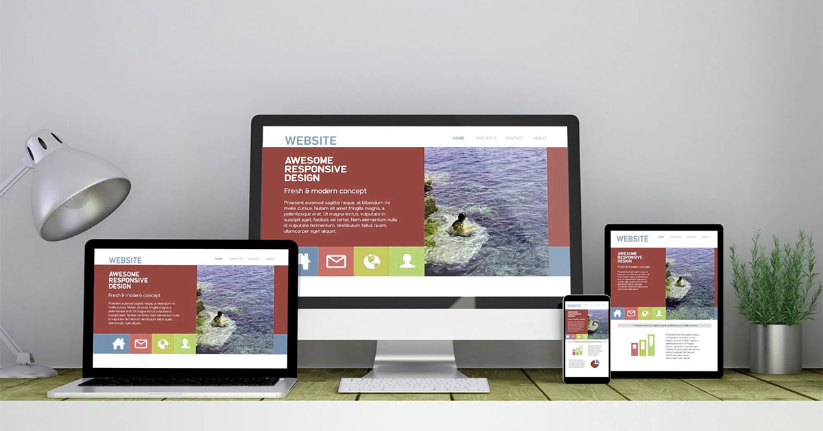
What is Mobile Responsive Design?
Imagine a website that transforms like a superhero, morphing from a sprawling desktop masterpiece to a pocket-sized marvel on your phone. That's responsive design in action. It's not just shrinking things down; it's about intelligently rethinking layouts, prioritizing content, and ensuring a seamless user experience, no matter the screen size.
Why Does it Matter?
Making Your Website Mobile-Friendly:
Mobile Responsive Design: Not Just a Trend, but a Necessity
In today's mobile-first world, ignoring responsive design is like opening a shop without a door. You're locking yourself out of a vast audience and crippling your website's potential. Embrace the responsive revolution, watch your user engagement soar, and bask in the warm glow of search engine approval. Remember, in the mobile maze, adaptability is the key to finding your digital El Dorado.
So, what are you waiting for? Unleash the power of responsive design and watch your website transform from a digital dinosaur into a mobile marvel, ready to conquer the ever-evolving digital landscape!
Here are some of the benefits of having a mobile-responsive website:
If you're not sure whether your website is mobile-responsive, you can use a free online tool like Google's Mobile-Friendly Test. If your website isn't mobile-responsive, there are a few things you can do to fix it, such as:


We create smart and reliable digital solutions for businesses of all sizes. Our focus is on quality design, strong performance, and strategies that help your brand grow online. Transform your vision into a fully functioning and highly responsive website with our expert website development services. Our skilled developers utilize the latest technologies to build custom... Introducing the revolutionary travel package management module. Craft dynamic itineraries, tailor pricing, track availability, manage inclusions, automate promotions, analyze trends. Optimize,... Social media marketing: We develop and execute a targeted social media strategy to increase your brand's visibility and engagement on popular social media platforms like Facebook, Instagram, and...
Services
Website Development
Tours & Travels
Social Media Marketing
Site Studio is amazing to work with! They are professional, responsive, and delivered a high-quality website that exceeded my expectations. I would highly recommend them to anyone looking for a website development service.
What our clients say about Site Studio
Satisfied people feedback
